
Products
H1: An overview of the blocks we use
On this page you will find all of our most used blocks and their individual functionalities. You can use this page to just look at which different blocks there are to get inspiration for coming pages, you can see all the different button types we use as well as get tips on what to think about when styling a webpage.
H2: Table of contents
Using Anchors, you can make a link into any part of the page you are currently on. Choose the heading you wish the link to lead to, then push the little flag icon above marked "Anchor" and give it a suitable name - remember this name. This gives the heading an anchorname and an id.
On the text you wish to link to the heading, choose "Link" above. In the dropdown list, choose "Link to Anchor in text". Never mind that it says you don't have an anchor in the text. The anchor will only appear if it's currently in the same Rich Text Editor. Just press OK. Then go into the source, and find the link (marked <a >) - type the name you gave the anchor after the hashtag (#). Done!
If you wish to link a Quicklink to an anchor, just input the hashtag (#) into the input field "URL Suffix/Custom URL". (Psst: this text is written in p.large)
Protip: if you find that the underline on the link (heading) is disturbing, simply add style="text-decoration:none;" after name="xx". (Psst: this text is written in p.small)
Text BlocksBanner BlocksButtonsDifferent headingsHero Blocks
Text Block with Top ImageGlobal BlocksProduct Comparison BlockExample page
This is a list in Litium
- Text 1
- Text 2
------------------------------------------------------------------------------------
Paragraph-styles
p.small
p
p.large
------------------------------------------------------------------------------------
p.small
p
p.large
------------------------------------------------------------------------------------
p.small
p
p.large


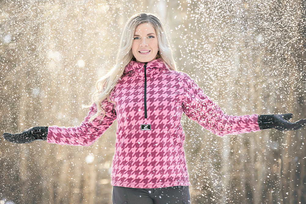
Header Image with Insert
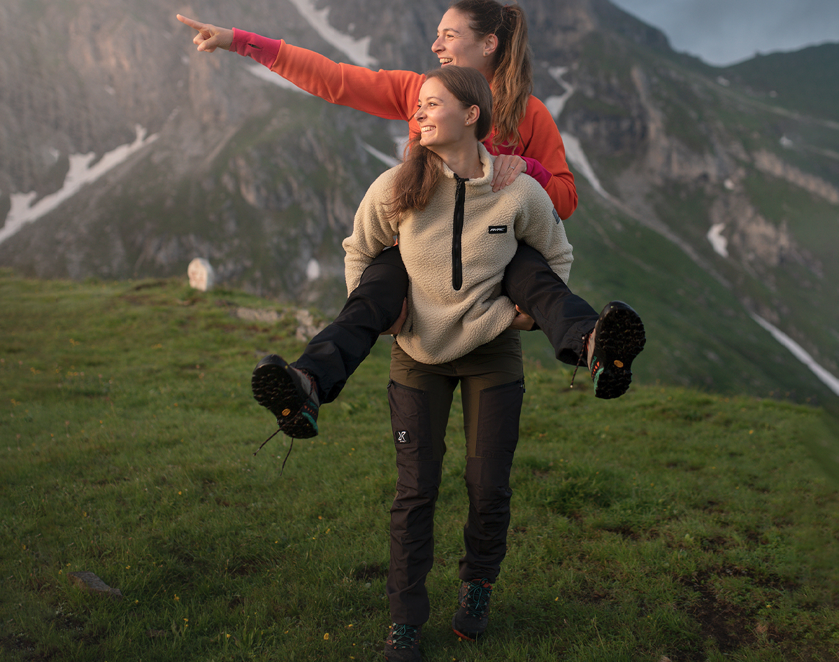
This block is often used on our category pages, with text on on side and an angled image on the other side. There is no margin on the top and bottom on default, but would you like to have some then you can add it down below.
The height of the block is dependent upon how much text there is in the Rich Text editor.
H3: Text Block with Top Image
H4: Also know as Text Image Block Columns
Here follows a short introduction to headings. Always make your headings move downward from H1 in their intended manner. It's not recommended to use headings as regular text. Google uses the coding in headings and text to rank the information on a webpage, hence it's important for the SEO (Search Engine Optimization) that the information on a webpage is presented in the correct way. In other words, H1 is ranked the most important level and H6 the least important. So, the tag itself (H1, H2 etc...) is essential for SEO, not for styling. If you would like to style the heading or text, do so by using CSS on the right tag. However, this isn't reccommended since the styling of the different heading and text is based upon our Graphic Profile.

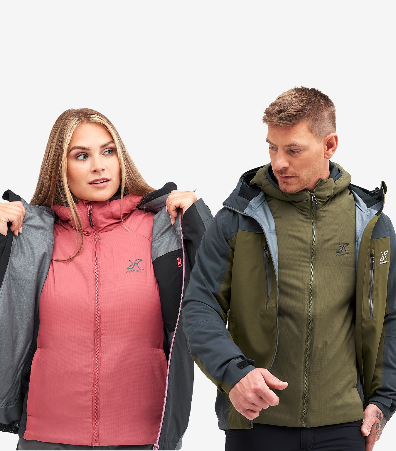
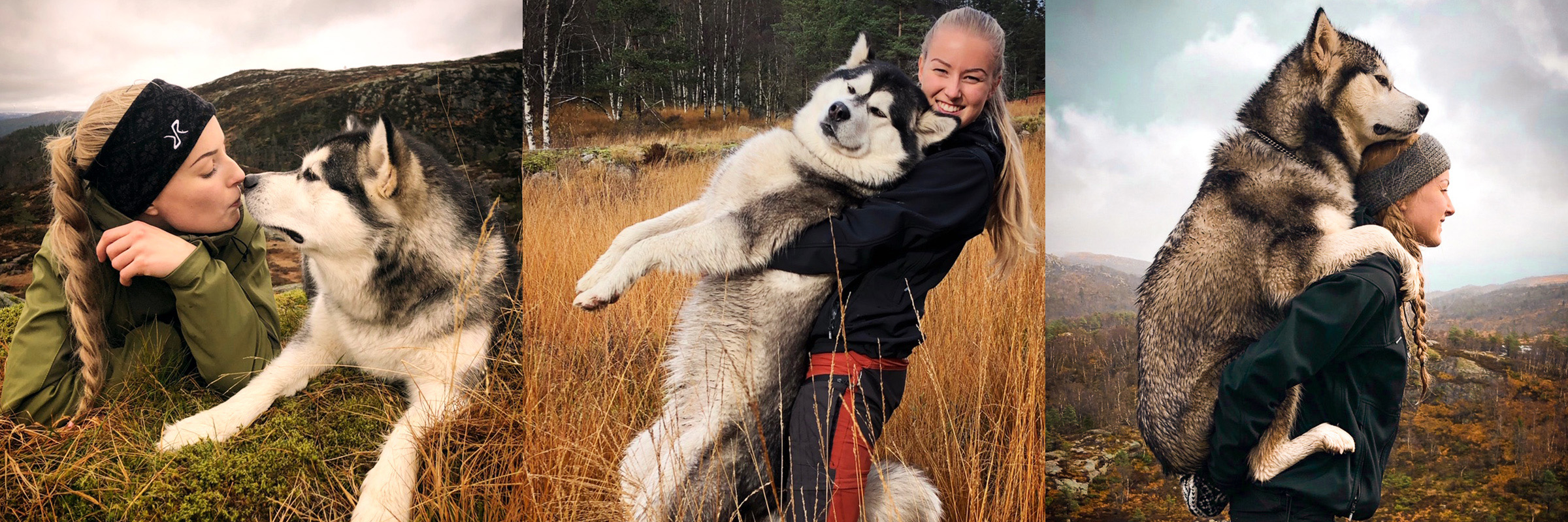
Text Block with Top Image
Images and text next to each other
The Text block with top image-block is often used like this, with several of them next to one and other creating an easy overview for the customer. The image scales depending on the amount of columns you choose. Compress the images for a smaller data size.
Also make sure you add an alt-text on images that require it. Icons for example usually don't require an alt-text, but the image above would benefit from having one. When this text is written you can't add an alt-text on images like the one above, but you can do it in the "Text Block". or on images added via the Rich Text Editor. The alt-text helps people with screen readers (for example blind people) to understand what the images portrays, and if the link to an images is "broken", the alt-text will show up instead.
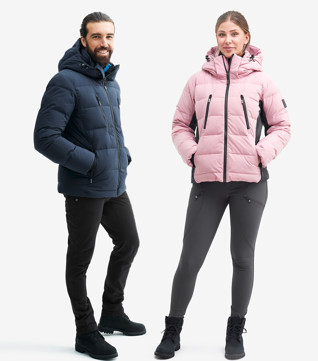
Text Block with Top Image
Block height
The height of the block (this block consists of 3 columns) depends on the amount of text in the one column which is the longest. The image is always the same height for a better visual effect. Think of this, try making the texts a similar length, making it easier on the eye. Make sure you move the focal point of the image to the spot in the images you find the most important. Otherwise the image will look like the on above - cropped. Do this by choosing Details on the image above.
You can add buttons into the rich text part of any Text Block with Top Image-block..
I'm a button
Text Block with Top Image - but NOT on top
As discussed before, the regular Text Block comes with a few disadvantages. Disadvantages that may be overcome by using the "Text Block with Top Image" in the same manner as the Text Block. Just att an image to one of the columns, and then text to the other (which one you choose dosen't matter, you can easily change the order of them later), then remove the margin (Choose "Yes" under Remove Margin Between) and voilá - the columns sit nicely and neatly next to one and other!

Switched orientation
You can also change the order of the text vs image, by selecting "Sort", the link next to "Add" above. The Image you add may also be a gif.
You may also change the order of the Image vs Text on mobile/Desktop/Tablet. Do this by choosing Device Specific Order down below. Have a look at this page in Mobile and you'll understand what this entails!
At the moment, you can't choose to have the image under the text.
Text Block
Make sure that all "regular" text is written in Normal for an even look site-wide. Per default headings as the one above have very little margin and padding making the text look cramped. Make sure to add about 1.5rem of margin on the top and 1rem at the bottom. It's great to work in "rem", since this is a relative measurement hence ideal for responsive websites. . "Px" is a fixed measurement, making it less ideal since it stays the exact size you define it even if the screen size gets smaller.
The block you see below this text block is a USP Scrolling Block. On default it shows the Unique Selling Points one has added via Website/Texts for showcasing on the homepage, but these can be changed into whatever you want. You can even add a little icon in there if you would like! 
Text Blocks and images
Just as the text explaining Text Blocks above, this is a regular simple Text Block. Using a Text Block for adding images is hardy practical but let's see how one can do that anyway. You can put the image straight into this rich text editor or you can do it by adding an other column and putting the image there. Simply write out your text and then choose to add an other column above ("Add").
Now, let's look at the disadvantages of adding an image into the Text Block.
-
It isn't all that time efficient since you have to add the image for every country separately. How ever, if you have images with text in them that need to be specific for each country or language, then this is the way to go. (If you do add an image with text in it, make sure you write and alt-text for the image so that those who can't see the image still understand what the images is trying to show. )
-
And also, the image placed into the Rich Text editor needs to be either cropped on before hand by you or the size needs to be changed under Image Properties. The heigh of the actual text part you wrote won't change its size according to the amount of text anymore. Well, to be frank it still does - because it reads the image as text as well. This is highly unpractical.
Sometimes it's necessary to do it this way, just bear in mind that it will demand more work and is harder to maintain.
Add 1.5rem of margin at the top and 1rem at the bottom if you don't want the blocks to touch.
Dynamic Ad Grid 1x3
Three images in a row, that are fetched from an Esales Ads Page by a specified "Tag".
Dynamic Ad Grid 1x4
Four images in a row, that are fetched from an Esales Ads Page by a specified "Tag".
Banner Grid Grid 1 next to 2
This basically creates a collage of images so that you can showcase even more of the amazing adventures our fantastic RevolutionRace community embarks upon!
Now - just for the fun of it, let's look at some links & buttons!
Extra small buttons
campaign-solid--xs campaign-hollow--xs
Small buttons
campaign-solid--s campaign-hollow--s campaign-ghost--s alternative-small a-small
Regular sized buttons
campaign-solid campaign-hollow btn-ghost btn-primary
btn-secondary campaign-ghost a-alternative
Large buttons
campaign-solid--l campaign-hollow--l campaign-ghost--l alternative--large a-large.
Different Heading-styles
Look down below to see what the different headings look like. However - and this is very important - DO NOT use the heading styles to style your normal texts. These are there to tell the Internet what kind of importance the heading is given - it has nothing to do with styling in CSS. If you want to, let's say make this text larger, then use a CSS-block or ask for help.
This is an H1-BANNER
This is an H1-BANNER in italic
This is an H1
This is an H1 in italic
This is an H1 Alternative
This is an H1 Alternative in italic
This is an H2
This is an H2 in italic
This is an H2 Alternative
This is an H2 Alternative in italic
This is an H3
This is an H3 in italic
This is an H4
This is an H4 in italic
This is an H5
This is an H5 in italic
This is an H6
This is an H6 in italic
Global Blocks
Blocks can be, or be made, global. Look out for the little blue circle under the Globe Icon. Changes made to a global block will affect all other instances of the same global block site-wide. But to be able to update the information in the global block along with all other changes on the page you need to forget about Quick Publish and instead choose Manage Publishing and then check the box marked Include All. Voilá!
Quicklinks Block
The block below is a Quicklink Block. This allows you to put images in buttons, they are then shown on the site as circles.
Product Comparison Table Block
This block automatically creates a table for comparison of features and prices. The only thing you need to do is to choose a few products (by writing their respective SKU number in the correct field - this can be found on the technical specifications of a product on the site). Choose which category it will link to and add the features you wish to be shown in the table.
The table isn't visible in preview mode.
Price, water column, breathability and fit is always visible in the table.
| Typhoon Pants | Cyclone Rescue Pants | |
|---|---|---|
| Vattenpelare | 20 000 | 20 000 |
| Andningsförmåga | 10,000 | 20,000 |
| Resår i midjan | ✓ | |
| Fluorkarbonfri DWR-behandling | ✓ | ✓ |
| Passform | regular | regular |
| Pris |
